Saturday, December 02, 2006
Line Integral Convolution (LIC)
I am yet to see the technique of LIC applied in the field of Meteorology. LIC looks appealing to me, and have much better resolution than any other vector visualization schemes. The down side is that when compared a well hand-draw streamline chart, its harder to understand the whole picture.
Actually streamline analysis is a very high level process which requires human understanding of the flow field, so high that sometimes imprecisions (to simplify flow fields) have to be incorporated to generate a "nice" streamline chart.
When one learns how to do streamline analysis, the instructor will tell you that the streamlines are everywhere tangent to the flow, and the density of the streamlines represents the flow intensity. However, actually the second requirement is only a consequent of the first provided the flow is non-divergent. However, in the atmosphere, especially in the lower and upper levels, convergence / divergence, is a very important attribute to look for! As such, I don't think many streamline analysts do really make a lot of attention to the second requirement! Afterall, the first job in the analysis is to identify the (anti)cyclonic centers, source and sinks and saddle points.
Wind barbs are chiral but taking different orientations for different hemispheres is kind of introducing too much complexity for no apparent purposes. Nevertheless, I have incorporated that flexibility. Note the different orientations of the pennants and barbs opposite the Equator.
Friday, December 01, 2006
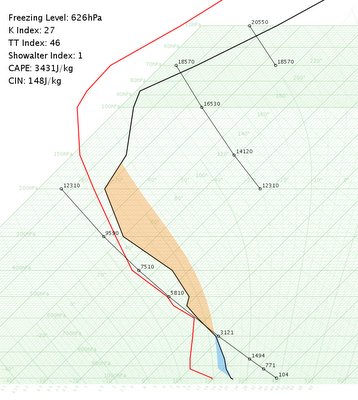
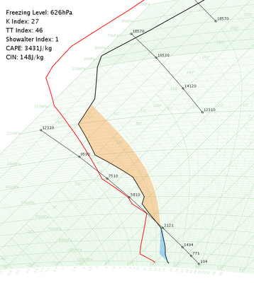
with CAPE and CIN shaded...


- The CAPE and CIN areaas are shaded! Haven't deal with the nasty scenarios when there were sections of the profile which is exactly dry adiabatic.
- Actually the starting of the parcel can be anywhere apart from the root of the environmental curves.
- I didn't include the SWEAT index because that is too N. American / Hemispheric based. Actually is there a S. Hemispheric version of SWEAT? Or a universal one?
- Which is better? A hodograph or a line of wind barbs on the right?
- Right now the program is ingesting a tabulated text file. It would be nice to be able to ingest raw PILOT codes.
Friday, November 03, 2006
Thermodynamic Diagrams in action

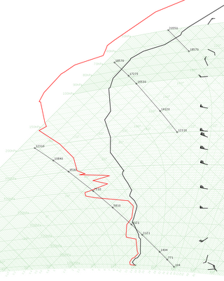
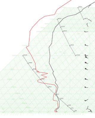
 Thermodynamic diagrams in action, Hong Kong Observatory style, although HKO uses tephigrams only. My personal opinion is that tephigram looks better, probably due to my upbringing in Hong Kong. It's just kinda strange (to me) that the dry adiabats curve (although Americans might complain the curved isobars in tephigram), and the angle between the dry adiabats and isotherms is getting smaller and smaller in higher levels.
Currently working on the instability indices. It would be nice to shade the CAPE and CIN, wouldn't it?
Sunday, August 13, 2006
Saturday, August 05, 2006
Blue Marble based HK TC Track Map
Topo Shaded HK TC Track Map
Wednesday, August 02, 2006
Subscribe to:
Comments (Atom)


