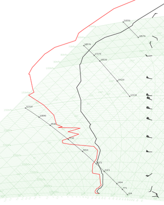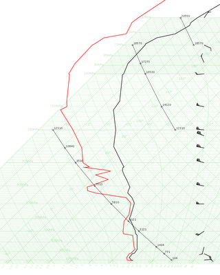
 Thermodynamic diagrams in action, Hong Kong Observatory style, although HKO uses tephigrams only. My personal opinion is that tephigram looks better, probably due to my upbringing in Hong Kong. It's just kinda strange (to me) that the dry adiabats curve (although Americans might complain the curved isobars in tephigram), and the angle between the dry adiabats and isotherms is getting smaller and smaller in higher levels.
Currently working on the instability indices. It would be nice to shade the CAPE and CIN, wouldn't it?